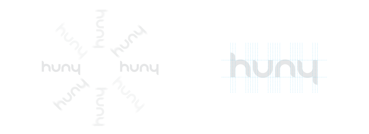
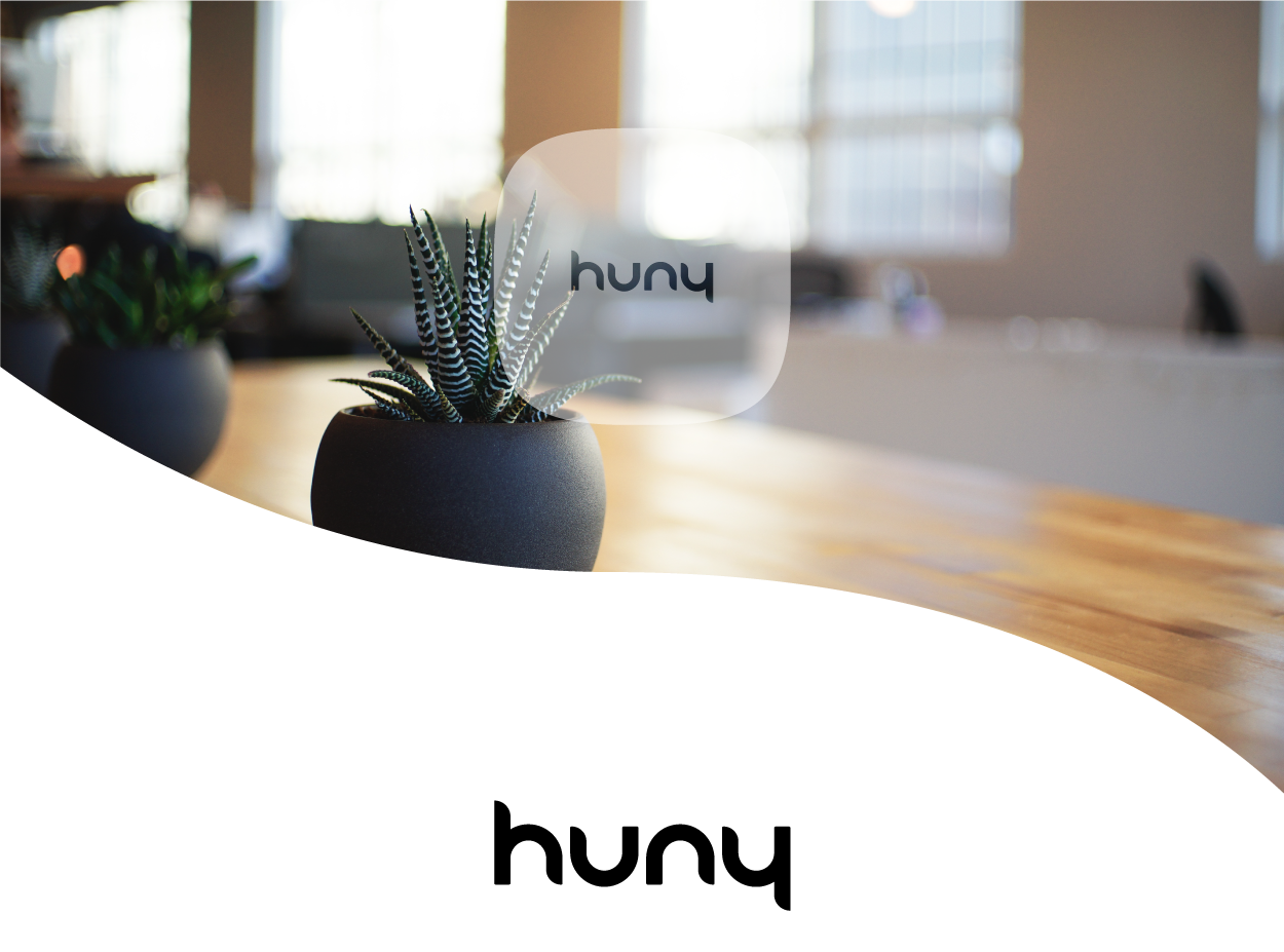
When creating the Huny brand many things were considered. It was important to communicate something what was both sharp and inviting. The strength of the font weight and the bold edges shows that Huny is a company that takes it’s hardware seriously and that it’s products are well though out and reliable. The softening of several edges makes the brand more inviting and communicates the ease of use of the mobil app.
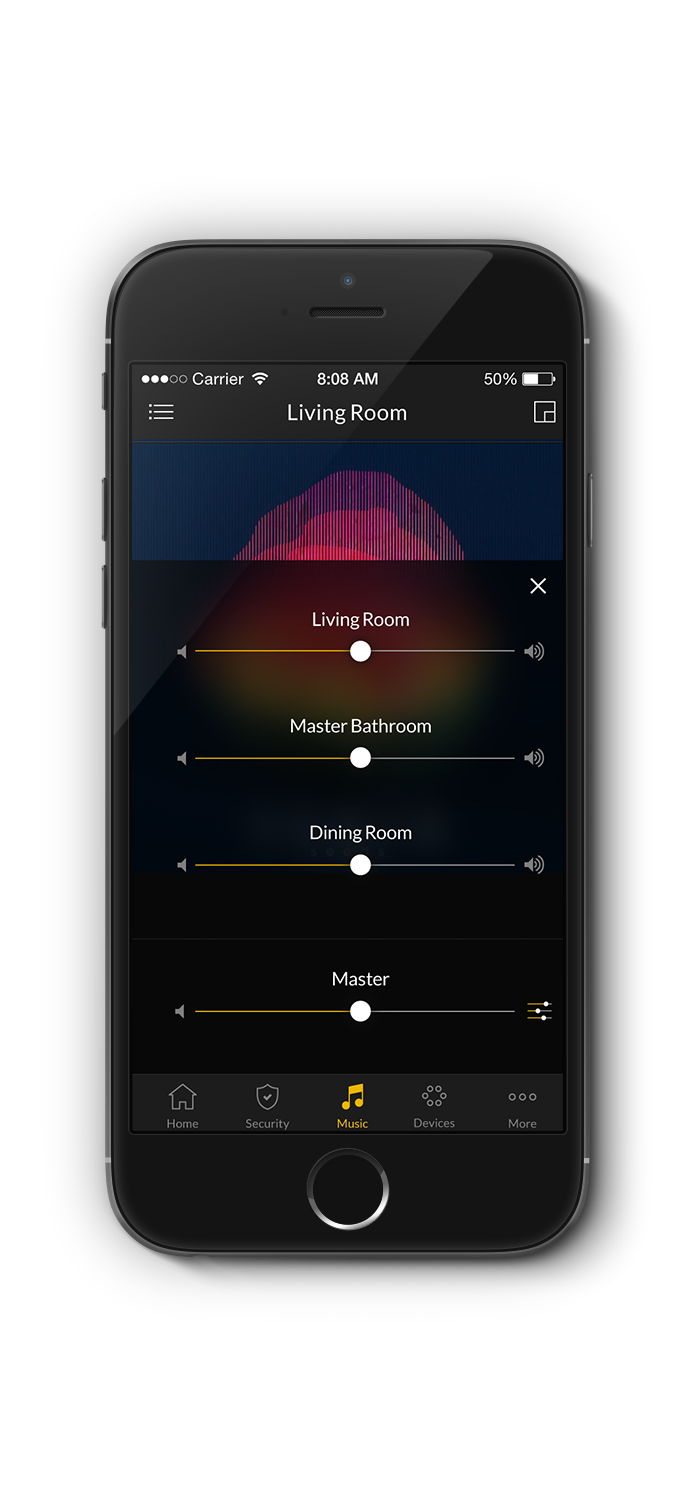
The colors utilized are a majority of blacks and whites with a minimal use of a yellow accent. The blacks offer an upscale feeling when used as the majority of color. Whites are used in excess to bring in openness and cleanliness. The yellow accent is used sparingly but strategically. It calls attention to useful items as well as breaking up the monotony of the blacks and whites. Overall when creating deliverables for this brand things should be kept minimal, refined, and sophisticated.